 There can be little that’s more delightful than watching baby Giant Pandas at play. Their antics and innate cuteness draw you in and make you want to play too.
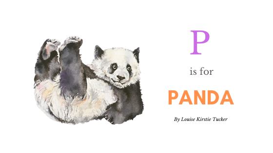
I recently attempted to capture their essence in these two watercolour panda portraits. The first painting is of a young panda lying on its back with its legs up in the air. It’s a very “baby-type” pose, and reminds me of when a tiny tot is first discovering how his limbs work and what they’re made for. Feet are such fun!
Capturing this playful pose called for a looser style. I didn’t want to overwork the fur with too many small brushstrokes, so I decided to use more wet-in-wet technique where I could. Painting black with watercolour is never easy (white isn’t great either, for that matter), so it’s a challenge to make it look interesting and not appear dull and flat.
It’s not simply black and white
I used a combination of colours to create the black, including Payne’s Gray (a personal favourite), purple, and black itself. Pure black was mainly used for details such as the eyes and nose, as well as for some of the areas of fur in deep shadow.
To paint white in watercolour you simply leave the paper as is. However, there are only a few areas of pure white highlight in any seemingly pure white area. I, therefore, filled the remainder of the white fur with a combination of ochre, pink and grey, with a just touch of blue. This added the necessary visual interest. I also used white gel pen to add a couple of individual hairs to the panda’s legs and face.

Sticking to a formula
I still had the colours from the first panda painting in my palette. Waste not, want not, is a great motto, and I’d so enjoyed painting the first panda, that I thought heck – why not paint another?
So using pretty much the same palette of colours – although I substituted a bit of indigo for the purple, I embarked on my second panda. I followed the same process as in the first painting, using soft wet-in-wet technique, letting it dry and then adding more layers to build the black fur. Then I added colour to the white areas of the panda’s fur, whilst leaving the paper to act as the true white highlights. (Sorry that it’s not the best pic, it’s too big for my scanner!)

What I learnt
I’ve been upgrading my drawing skills with a few Udemy courses this year. I must say they they are excellent resources, well worth the investment, and I believe that my drawing has improved. The truth is that if you don’t get the original drawing right, all your hard work painting it is pretty much wasted because you’ll keep spotting the things that just don’t look right.
With watercolour, you obviously paint the shadows and details in, so what I’m referring to here are things like proportion, shapes and placement. I’ve learnt to spend more time refining my drawing before I rush into painting and I’m happy with my progress.
These two paintings also helped me to practice a looser style – something which I found really enjoyable and quite freeing.
Just the essence
So, the end result is not about hyper-realism. Although I greatly admire artists who achieve that, that’s just not my aim in painting. Rather, I have tried to capture a moment, a character, a gesture…, and maybe, maybe in this case, a good dollop of cuteness.
To view more of more watercolours on this website, please click here.
Click here to follow by board on Pinterest or like my page on Facebook.