Monochrome paintings have a single colour or hue.
Monochrome paintings are enchanting. There’s something a little bit special about stripping away colour and paring down an image to shades of grey, black, blue or sepia.
In a world of dazzling colours, it may not make sense to some. Why choose black and grey over a myriad of exciting colours just shouting to be spread across your paper or canvas? But hey, I found out that it’s not just me that feels drawn to turn away from polychromatic works to their more subtle cousin, the monochrome. Masters like Picasso, Degas, and Rembrandt deliberately used monochrome for various reasons, from a love of print-making to showing their mastery of a subject.
Here are a few reasons I think monochromes are underrated and why I enjoy painting them:
1. Simplicity is key.
A monochromatic work helps an artist to keep it simple. Without the temptation of colour, it’s easy to focus on the subject directly and not be tempted to overwork a piece.
Somehow, and I don’t really know why, it’s easier to leave a monochrome alone when you get to the finished stage. Often with colour, I’ll think – “This needs a darker layer, or that area needs some work there,” resulting in an overworked piece that I’m not happy with. And don’t even start with background – this is where I often spoil a painting by adding unnecessary colours or details. (I hope you added your own sad-faced emoji here.)
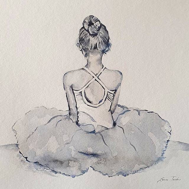
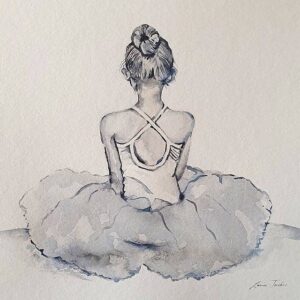
My most recent painting of a young ballerina in monochrome is a case in point of keeping things simple. I wanted to convey the lightness of her costume’s tulle skirt without adding the detail from the original photograph. I used a wet-in-wet technique and two washes of Payne’s Gray and once this was dry, I simply outlined the skirt. I also added a few simple lines to show form where necessary. And then I left it alone.
2. Monochromes show the play of light and shadow so effectively.
Well that is pretty much self explanatory. The contrast of light and dark and the subtle gradation of shades in between is very effective in a monochromatic work.
3. Monochromes are magic at conveying mood.
If a painting needs a melancholy air or a sense of isolation, calm or peace, then monochrome should be your first choice.
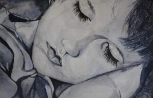
For example, I painted my sleeping toddler some years back from a colour photo I’d taken. In the photo he is wearing a bright orange t-shirt, and although orange is a lovely warm colour which I love to paint with, the choice of monochrome creates the calm and peaceful mood in this painting. That’s why I don’t believe that a full colour version would have created the same effect or had the same impact as the monochrome.
4. Monochromes can teach an artist a few things.
Monochromes are a great way to go back to basics and to educate yourself as an artist. They are a useful education tool for learning about shades, gradients, composition and line.

5. A portrait is made more dramatic in monochrome.
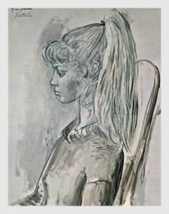
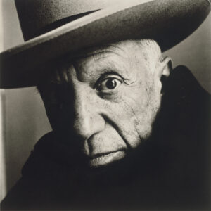
Take this black and white portrait of Pablo Picasso by Irving Penn, for example. See how the artist’s character and expression is perfectly captured by the great photographer. The intensity of the “staring eye” connects directly with the viewer and seems to look right into you, whilst the other eye is almost completely in shadow. Consequently, this results in extreme drama!
6. Monochromes look good on any wall and with any decor.
To me, there’s something timeless about a monochrome painting. Monochromes often look best framed simply and that makes them the perfect partner for more ostentatious works. They can be hung alongside almost anything and their subtlety will shine through.
A monochrome will not dictate its environment but will rather blend in with anything.
Well, that concludes my 6 reasons for painting in monochrome. Please feel free to comment on this post with some of your own reasons and thoughts.
To view more of my watercolour art on this website, please click here.
View my Facebook page by clicking here.


Ur actually brilliant